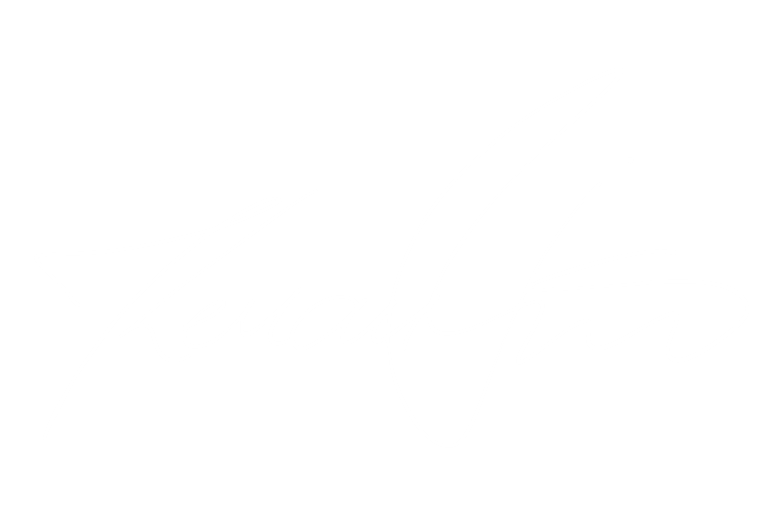
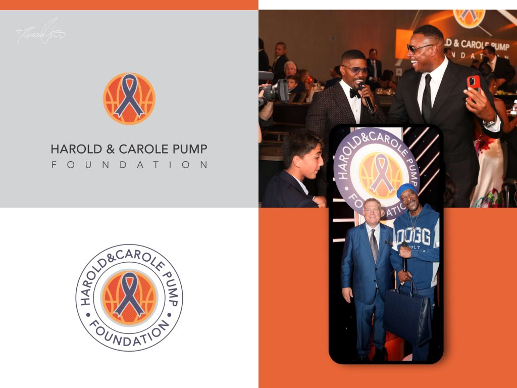
Harold & Carole Pump Foundation is one of the defining projects of my career, a logo that represents the level of quality, professionalism, and strategic thinking behind my design work.
The foundation was established by Dana and David Pump in honor of their parents, Harold and Carole Pump, with a mission focused on raising awareness and funds for cancer treatment, research, and advanced medical technology.
The logo was selected through a highly competitive and rigorous design process, standing out as the chosen identity for an organization recognized across the United States through major charity events and public appearances. Through the foundation’s work, public figures such as Snoop Dogg, Michael Phelps, Jamie Foxx, Paul Pierce, and Mike Tyson have participated in charity events and campaigns connected to the organization.
This project represents more than visual identity design — it reflects trust, responsibility, and the ability to create branding capable of standing behind organizations with real impact and international visibility. It is the kind of project that demonstrates long-term stability, reliability, and a professional approach without compromise. Every detail was developed with the intention of creating a timeless and recognizable identity that could confidently represent the foundation across events, media, digital platforms, and official materials.
The Harold & Carole Pump Foundation has contributed more than $13.3 million toward cancer-related programs and medical centers, including the Carole Pump Women’s Center, the Harold and Carole Pump Department of Radiation Oncology, and the Leavey Cancer Center at Northridge Medical Center. Their mission continues to unite communities, athletes, public figures, and supporters in the fight against cancer while funding treatments, services, and advanced medical care.
All photographs used in the presentation of this project were sourced from the official foundation website and are used exclusively for presentation purposes. All rights belong to the respective owners of the photographs and logo. More about organization.
For this project, I created a strong and memorable visual identity for Hardwoods & Flooring a Minnesota-based flooring company
specializing in premium hardwood and flooring solutions. Inspired by craftsmanship, durability, and timeless materials, the logo was designed to reflect precision, trust, and the natural elegance of wood textures and interior design. The final identity combines a modern professional look with a bold, recognizable symbol that strengthens the brand’s presence across digital and print platforms. More about platform.
Change Studio is a premium hair studio based in Sarajevo, BIH. The project involved a complete brand refresh, starting with a redesign of the original logo and extending across the entire visual identity, from POS materials to the website.
Together, we developed a timeless black-and-white aesthetic to reflect the studio’s elegant, modern, and premium character.
The brand is now actively growing, with future expansion already planned. As the studio evolves, the branding system will continue to expand, introducing new visual materials and brand elements while maintaining a consistent and refined identity. More about studio.
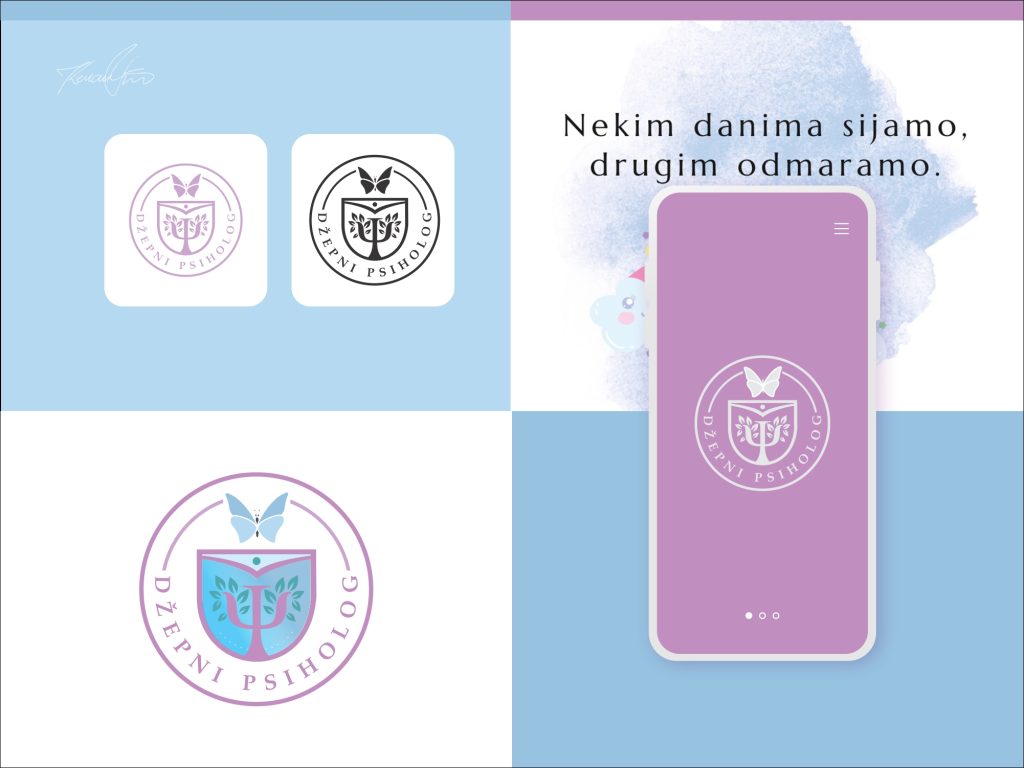
Pocket Psychologist is much more than a brand, it is an inspiring story that began in Sarajevo and grew into one of the most recognizable psychology projects in Bosnia and the region
Behind this story stands a young and successful psychologist from Mostar, a mother of three with more than 12 years of professional experience, whose innovative approach has brought psychology closer to thousands of people.
Through authentic communication, educational content, and continuous support for patients across social media platforms, Pocket Psychologist has evolved into a powerful and respected brand that is changing the way people perceive mental health. Empathy, expertise, and a modern approach have become the foundation of a growing community that provides support, understanding, and a sense of safety to people across Bosnia and Herzegovina and the wider region.
Today, Pocket Psychologist represents a unique blend of professionalism, trust, and human connection — a platform proving that psychological support can be accessible, modern, and close to everyone. More about brand.
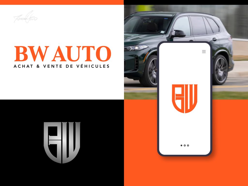
BW Auto is a modern automotive company founded in Quebec City with a mission to simplify the vehicle-selling process through complete customer support and a seamless “turnkey” experience.
Specializing in fast vehicle evaluations in less than an hour, BW Auto also offers accommodation sales solutions designed to help customers offset taxes when purchasing a new vehicle.
Built on trust, speed, and professionalism, the company focuses on delivering the best possible value for every vehicle while ensuring clients experience exceptional peace of mind throughout every stage of the sale. Their efficient process and customer-first approach have positioned BW Auto as a reliable name in the automotive industry in Quebec.
For the brand identity, the vision was clear from the beginning to create a strong and memorable symbol inspired by the essence of automotive design. The result is a unique logo that reflects movement, precision, confidence, and the recognizable character of a modern car emblem, perfectly aligned with the company’s innovative and professional image. More about saloon.
Your logo is the face of your brand and the first thing people remember.
Hire a professional logo designer to create a unique identity that stands out.